Recent searches
Search options

#dataviz


Significance can get lost over time.
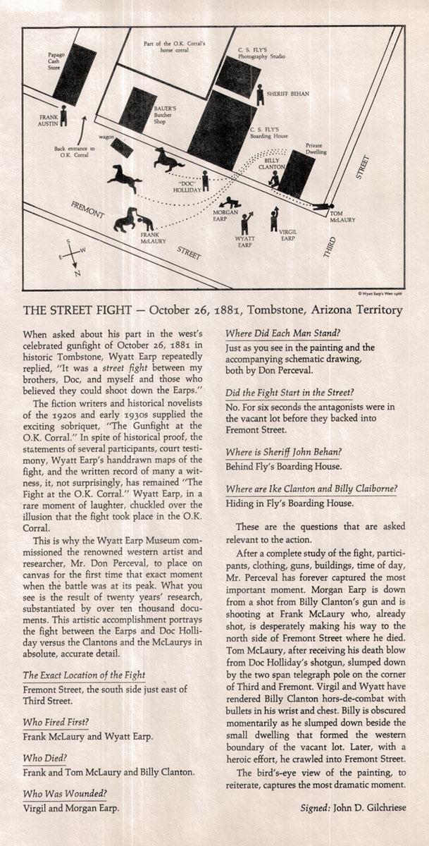
For some the "Gunfight at the O.K. corral" was about something, something Wyatt Earp, something Doc Holliday. Who knows...
But back in the 60's a museum put out an info-graphic that anchors the event in facts. With a little study it comes out that this was the "Wild" lawless West finally being confronted by the rule of law with officers to use it.
It's not just some romanticized cowboy thing, it was a culture clash.
#maps #law #map #dataviz #history

Updated every month: Access the raw datasets behind every #dataviz we've ever released online. The IIB Data Room. 500+ sheets, 1200+ datasets. Continually updated.
https://informationisbeautiful.net/data/
. Topics include 'Per Second', 'WaterWorld', several articles about plastics, 'Two Years of the Russia-Ukraine War', among others. Most links are either geni.us or Google Docs spreadsheet URLs. Dates range from most recent (01 Aug 2024) to oldest (24 May 2023)")

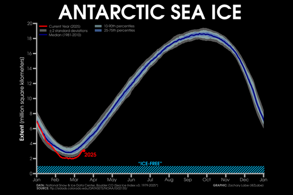
February 2025 data is now available for both Antarctic sea-ice thickness/volume (https://zacklabe.com/antarctic-sea-ice-extentconcentration/) and global sea-ice volume (https://zacklabe.com/global-sea-ice-extent-conc/).
Last month's global sea-ice volume remains at record low levels for the month of February in this dataset (GIOMAS).

Recent data doodle - arc diagram of morning peak trip flows on TTC Line 2


With an ongoing trade war and stocks sliding into correction territory in the last week, a question emerges: Is a recession next? Jasmine Cui, the NBC News reporter on the data / graphics team, details what the recessionary data signals and economists say: https://www.nbcnews.com/data-graphics/recession-warning-signs-trump-economy-what-know-charts-rcna196221 #dataViz


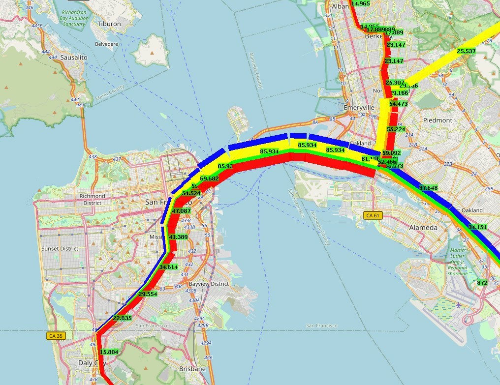
In der Bay Area fährt der #BART - eines der schnellsten Metrosysteme der Welt. Kernstück ist die Transbay Tube zwischen #SanFrancisco und #Oakland. Es sind genaue Daten zu den Stationen, in denen ein- und ausgestiegen wird, verfügbar. Diese erlauben es, die Nachfrage zu visualisieren. 86.000 Fahrgäste sind im Januar 2025 an einem Wochentag unter der Bay unterwegs. #DataViz

Russia's war on #Ukraine, visualized in a collection of annotated charts:
- Ukrainian territory controlled by Russia
- missiles and artillery fire
- civilian deaths and injuries
- damaged civilian structures
- internally displaced people and Ukrainian refugees abroad
https://www.dw.com/en/human-toll-of-russias-war-in-ukraine-explained-in-graphics/a-71495389
(incl. code and data repository, via DW Data)

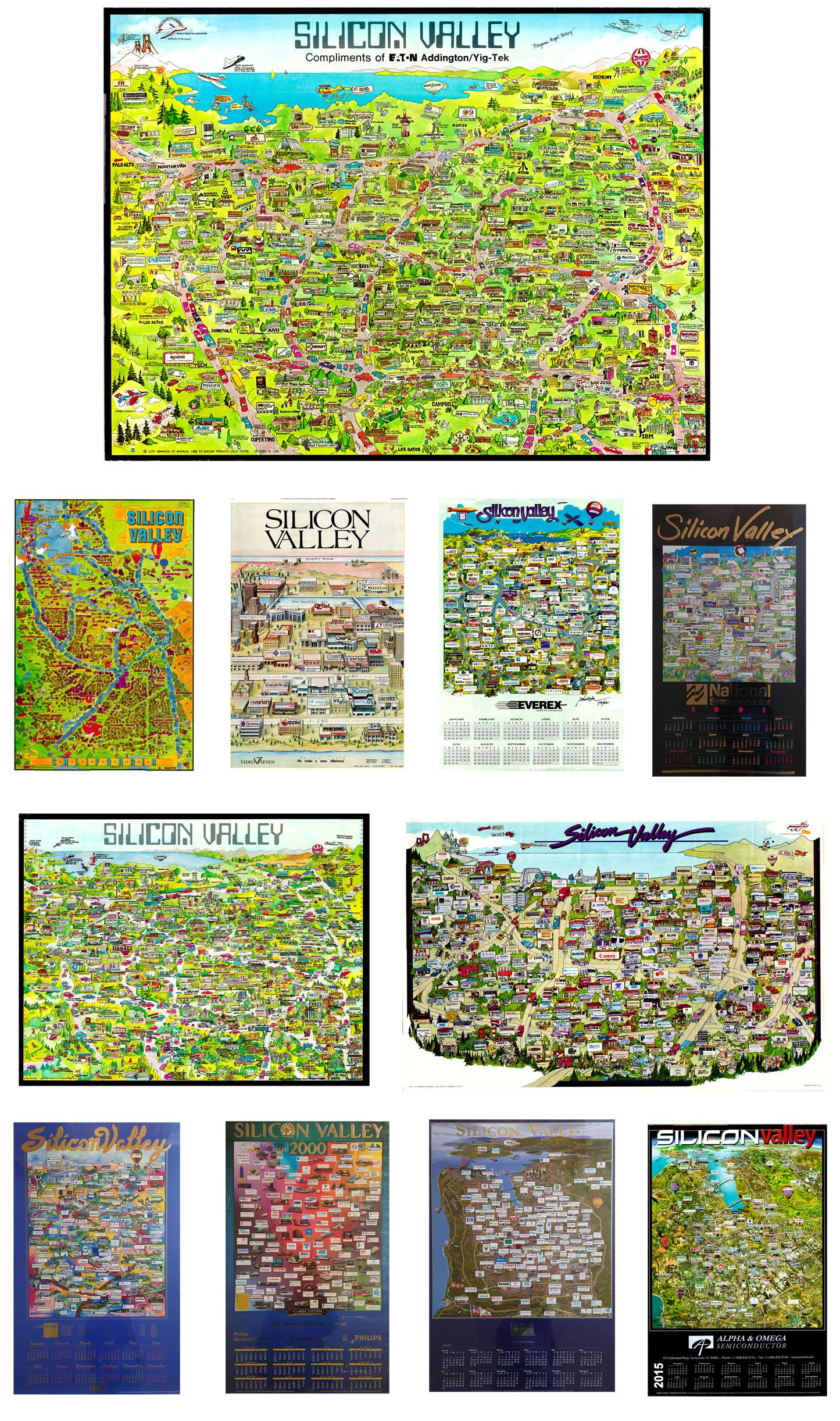
Coming soon, "Silicon Valley & Tech Regions".
It's a topic we've found fascinating for years, not just in its mapping, but in the phenomena itself. We've heard Silicon Valley described as a example of "emergence" where components come together and in the right circumstances, at the right time, wild growth, interaction & change occur.

Slowly making updates to my #StickersAndStamps project.

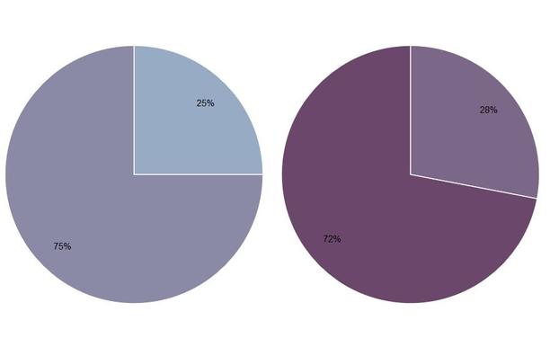
Happy Pi Day! I'm reminded of this old piece on Pie charts: "In Defense of Pie Charts, and Why You Shouldn’t Use Them"
https://medium.com/@kristinhenry/in-defense-of-pie-charts-and-why-you-shouldnt-use-them-df2e8ccb5f76

 @seav@en.osm.town
This video is a really pretty visualization of the A* pathfinding algorithm using #OpenStreetMap road network data for #Chicago and #Rome as examples.

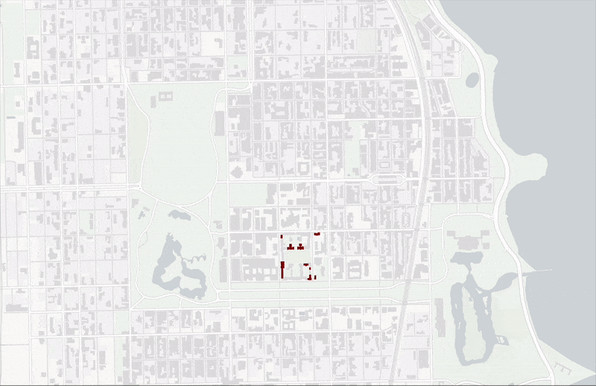
A great job at not just telling the story of a university, but the complex history of race, wealth and community.
https://chicagomaroon.github.io/data-visualizations/2025/uchicago-property/

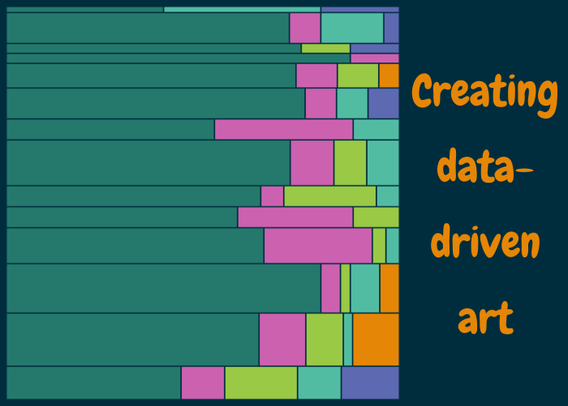
 New blog post about data art!
Have you ever wondered:
 What is data-driven art?
 Why do people make data art?
 How do I get started making my own?
Then this blog post is for you!  It includes an example using #TidyTuesday data - with code in both #Python and #RStats!

Some light reading for a bit of a distraction, if you will: Vivian Li from @thepudding looked at how "cultures can hear the same physical sounds yet translate them into language so differently".

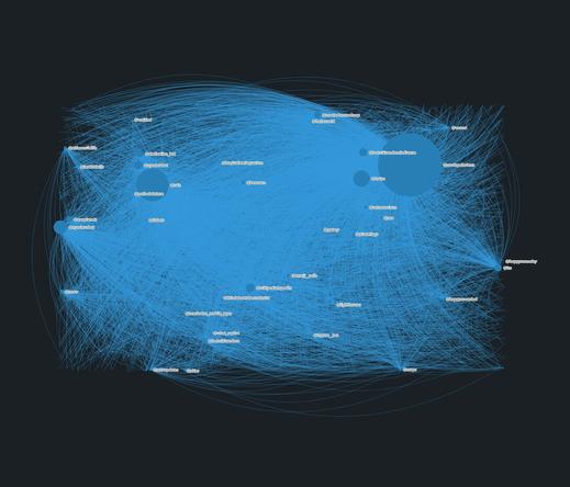
Neat. My "Analyzing fediverse followers of my creative online bots" data visualization was accepted for this year's Information is Beautiful Awards' longlist.
I'm super happy to see that several of my data visualisation projects were long-listed at the 2024 Information is Beautiful Awards!
Check out the full longlist here: https://www.informationisbeautifulawards.com/showcase?action=index&award=2024&controller=showcase&page=1&pcategory=long-list&type=awards [www.informationisbeautifulawards.com]


Sometimes, updating a Data Art piece is just too much of an emotional drain. And the piece must remain out of date.
But to be honest, that's part of the piece itself.
How Big is 400,000? https://kristinhenry.github.io/howBig/
I wrote a bit about the piece: https://kristinhenry.medium.com/how-big-is-400-000-922841dbc986

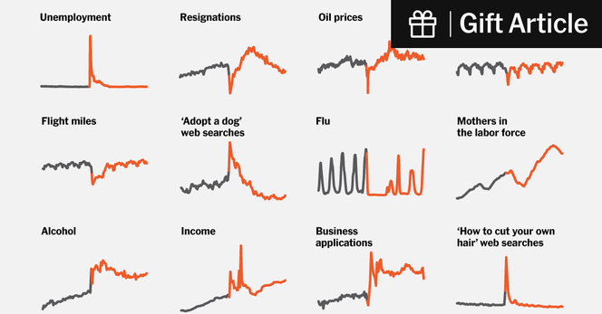
Pretty fascinating look at how "Covid changed everything", in 30 charts.
"Decades from now, the pandemic will be visible in the historical data of nearly anything measurable today: an unmistakable spike, dip or jolt that officially began for Americans five years ago this week."